highlights
Echo Cohort Visualization
Yale Medicine, Biomedical Informatics & Data Science — June 2024
My Role
Lead Designer — Feature research, visual design, user flow, prototyping
Team
Hua Xu, Robert T. McCluskey Professor
Huan He, Research Scientist
Lingfei Qian, Postdoctoral Associate
Huan He, Research Scientist
Lingfei Qian, Postdoctoral Associate
Timeline & Status
2 Months, handed off for implementation
Overview
Many research efforts focus on developing SQL algorithms for trial matching, but these often remain as single-interface prototypes, leaving doctors to rely on manual, time-consuming patient recruitment.
To address this, Dr. Xu assembled a team, including myself, to automate the recruitment process. As the sole designer, I conceptualized and visualized the product, turning research-driven algorithms into a functional, intuitive tool for real-world use.
To address this, Dr. Xu assembled a team, including myself, to automate the recruitment process. As the sole designer, I conceptualized and visualized the product, turning research-driven algorithms into a functional, intuitive tool for real-world use.

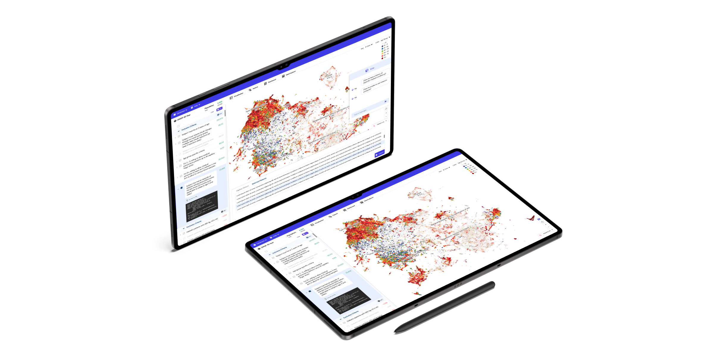
01.Interface Overview.

02. UI components.

03. Chatbot-enabled detail page on the second layer.
context
Bridging the Gap: Transforming Algorithms into Complete Tools for Healthcare Trial Matching
Many researchers are working on SQL algorithms to support trial matching in healthcare. While some have built systems with interfaces to present these algorithms, most efforts remain incomplete. Fully developed products that integrate these solutions into a usable, end-to-end tool for medical professionals are still rare in the market.
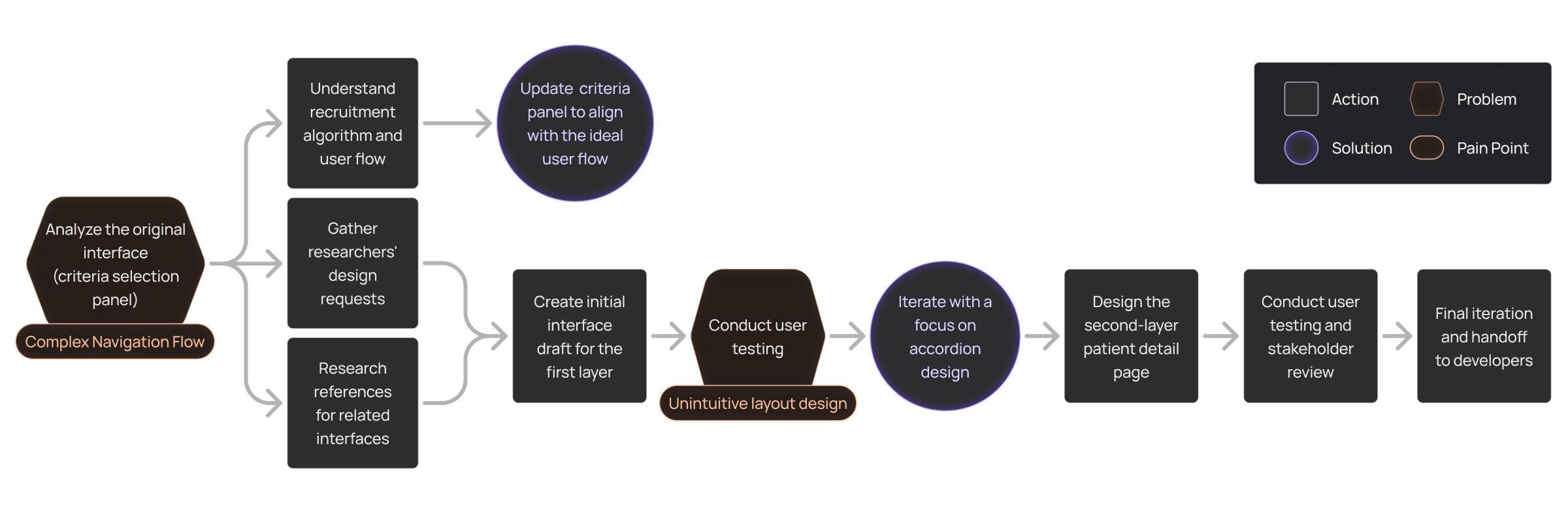
1.0Design Workflow
Identifying & Solving Key Usability Issues
This wasn’t going to be the typical Cohort Visualization
Cohort visualization for trial matching is a niche product with few existing tools on the market. This lack of references presented constraints and challenges in identifying and addressing usability problems. To navigate these, I collaborated closely with researchers through iterative discussions and revisions to refine the product.
Limited existing products for reference or inspiration.
Lack of established usability benchmarks for this niche.
Defining usability requirements without clear precedents.
Aligning the interface design with diverse researcher needs.
Ensuring functionality integrates seamlessly with trial matching workflows.
Problem 1: Misaligned User Flow
1.1 Analysis
- The criteria selection panel on the original interface didn’t align with researchers’ workflow, creating inefficiencies and confusion during trial matching.
- I analyzed the user flow to identify misalignments, particularly focusing on unclear button functionality and its impact on user experience.
2.0User Flow
As part of my analysis, I identified that the misalignment extended to key interactive elements. The functionality of the 'Run' and 'Cancel' buttons was unclear, leading to user uncertainty and inefficiencies in completing tasks.

2.1 Criteria Selection Panel
Run Button:
Users were unsure whether clicking "Run" would:
1. Save their customized SQL query.
2. Display the cohort visualization for the selected criteria.
The button lacked clear labeling or tooltips, leading to uncertainty.
1. Save their customized SQL query.
2. Display the cohort visualization for the selected criteria.
The button lacked clear labeling or tooltips, leading to uncertainty.
Cancel Button:
Users did not know if clicking "Cancel" would:
1. Revert the customized SQL to its original state.
2. Exit the customization process entirely without saving changes.
1. Revert the customized SQL to its original state.
2. Exit the customization process entirely without saving changes.
1.2 Solution
Address misaligned user flow by optimizing the criteria selection panel, centralized CTA buttons, and introduced dropdown/multiselect features. I also redesigned the coding area for better readability.
- Before Interface: Scattered CTA buttons and limited flexibility for criteria selection.
- After Interface: Centralized CTA buttons, dropdown/multiselect features, and dark-coded SQL area for enhanced usability.

2.2Before/After Interface Comparison
1.3 Outcome
Outcome 1: Optimized User Journey
This optimized user journey aligns with the refined user flow, ensuring smoother navigation and task completion.

2.3Illustrated user flow aligning with optimized interface.
85% of users found the new interface more intuitive in testing.
Outcome 2: Integrated Researcher Input
First draft design integrates all researchers' requests into a visually cohesive and functional interface.
2.4First draft of the full interface
Problem 2: Overlapping Elements and Inefficient Layout
2.1 Analysis
The first draft, inspired by Google Maps, aimed to incorporate drag-and-zoom functionality and a chatbot for querying patient data. However, user testing revealed several challenges:
- Overlapping floating elements (chatbot, criteria tab and patient list) obstructed key data visualization areas, reducing clarity.
- The patient list's placement at the bottom limited the number of visible patients (six per screen), impacting usability.
- Combined challenges made navigation and visualization inefficient for researchers.
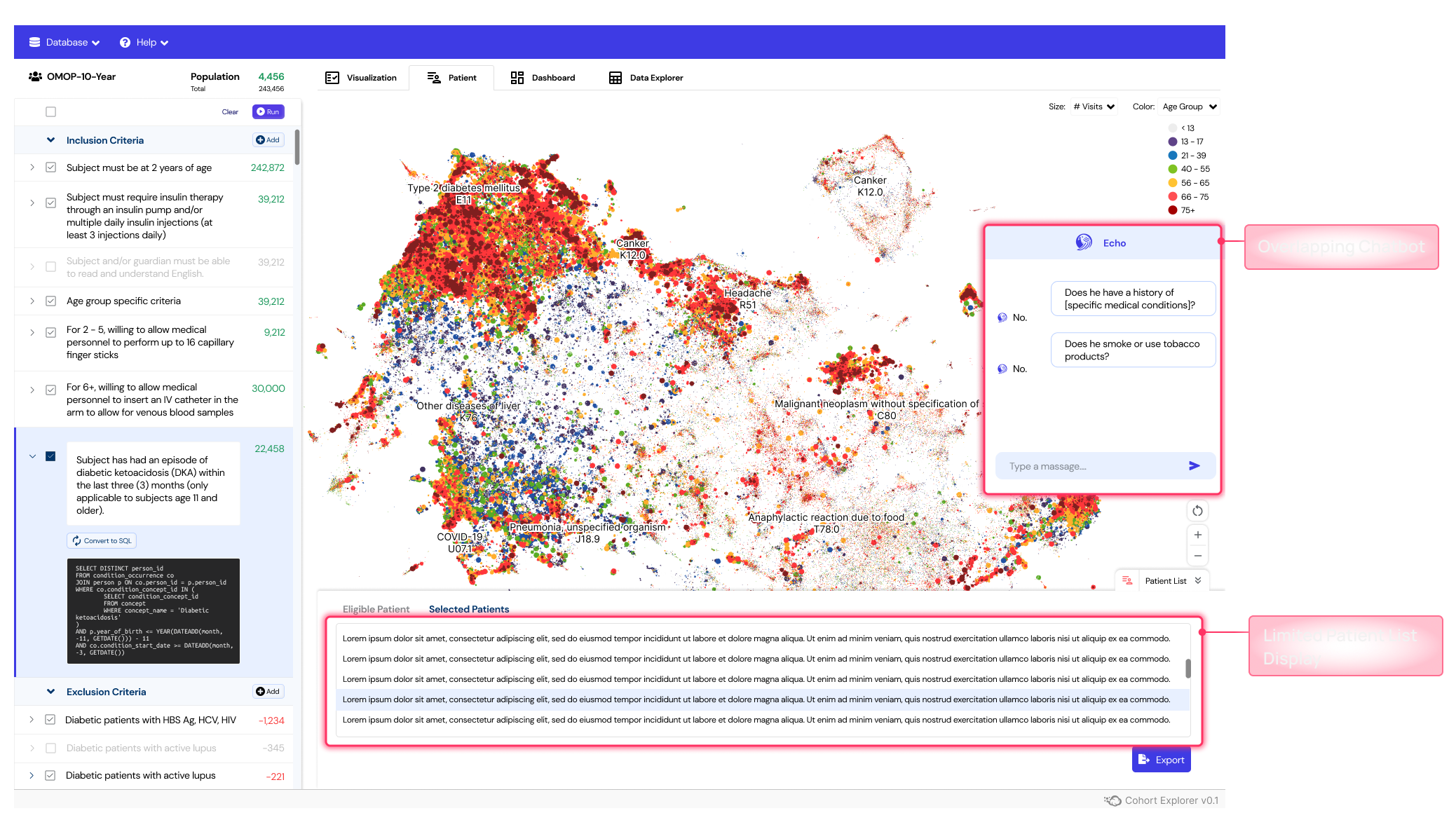
2.5Initial draft revealed overlapping interfaces and reduced patient list visibility.
- Accordion Design improves usability by grouping information hierarchically.
- Chatbot Repositioning ensures uninterrupted visualization.
2.2 Solution
To address the challenges identified during user testing, I implemented the following solutions:
- Conducted research on dashboard layouts to find the most efficient solution for information-dense interfaces.
- Adopted accordion design for grouping information hierarchically and improving usability.
- Moved the chatbot to the second-layer patient detail page, aligning its functionality with single-patient queries.
- Redesigned the patient list and criteria tab using an accordion structure for better visibility and organization.
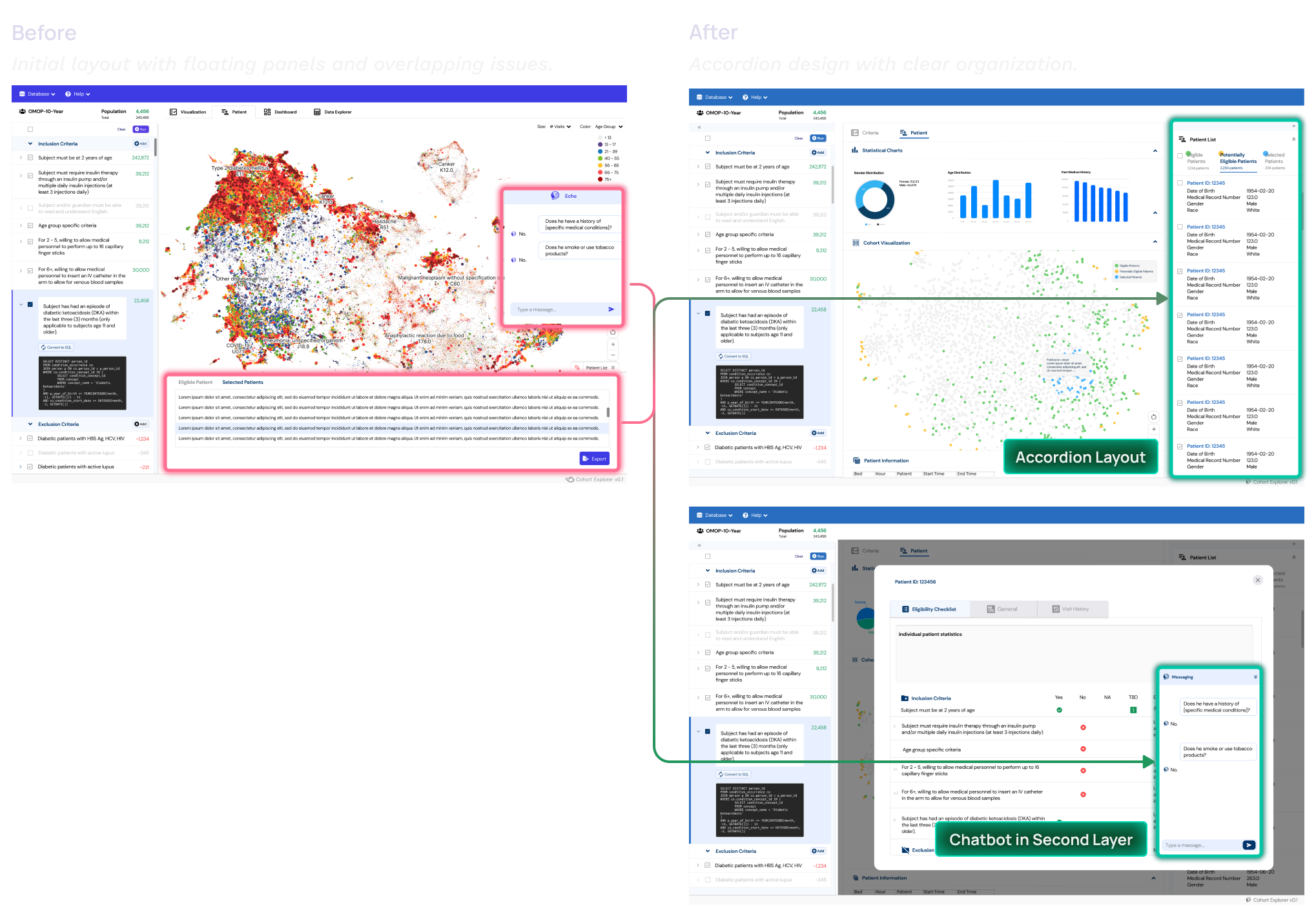
2.6Interface solution implementation
User testing revealed that researchers found the accordion design intuitive and appreciated the improved visibility of cohort data and patient lists.
UI Design Evolution
Balancing Aesthetics and Usability
The UI design process focused on creating a user-friendly and visually cohesive interface tailored to the needs of researchers and medical professionals. Key goals included improving clarity, aligning with user preferences, and ensuring accessibility.
Problem
- The initial color scheme of Vibrant Blue-Violet was designed to evoke a modern tech feel. However, feedback during user testing revealed it felt too 'light' or 'playful' for the target audience—primarily senior researchers and doctors.
solution
- The theme color was changed to a Professional Deep Blue, reflecting professionalism, trust, and seriousness while maintaining a modern look.
outcome
- The new theme received positive feedback during user testing, as it resonated better with the target audience’s preferences and expectations.

3.1Updated theme color from vibrant blue-violet to professional deep blue based on user feedback.
Following the theme color update, I curated a refined color palette to ensure consistency, readability, and a professional tone.

3.2 Optimized color system reflecting the revised theme color for enhanced usability and visual consistency.
I chose DM Sans for its clean, modern design and excellent readability, making it ideal for data-heavy interfaces. Its geometric structure ensures clarity while maintaining a professional yet approachable feel for researchers and medical professionals.

3.3 Typography -DM Sans

3.5 UI components
The dashboard components are designed with clear labeling and a distinct visual hierarchy to enhance visibility and usability. Interactive elements improve user engagement, while the accordion design streamlines complex information, creating a structured and intuitive layout.

3.6 Redesigned accordion structure for improved navigation and clarity
Featured in this anatomy is a single-level accordion with a nested multi-level accordion.
- Expand-all or collapse-all function: open or close all accordion rows.
- Divider: horizontal rule between expand or collapse function and the accordion.
- Expanded single-level accordion: chevron to expand or collapse single-level accordion.
- Accordion heading: descriptive label.
- Expanded multi-level accordion chevron: trigger to expand row.
- Multi-level header: descriptive label for the nested level.
- Multi-level divider: horizontal rule separating accordions.
- Expanded multi-level panel: revealed content.
Accessibility was a key focus in this design. I refined colors and typography to align with WCAG contrast and usability standards, improving readability and ease of use. The Figma Stark plugin was used to validate text and background color compliance.
Color Contrast Compliance
Typography & Readability
I refined typography to enhance readability in data-heavy interfaces, increasing the minimum font size to 12px to improve legibility and meet accessibility standards.
outcome
User testing confirmed that the new theme improved readability and usability, aligning better with the expectations of researchers and medical professionals.

3.7Updated UI components based on accessibility test.
key takeaways
I have gained invaluable insights and growth that have significantly impacted my career:
- Co-Creation with Researchers: Iterative design and close collaboration were key to refining the UI. Real user feedback shaped the final design, ensuring it met both usability and accessibility needs.
- Understanding User Expectations: Initial assumptions about a tech-inspired color scheme didn’t align with researchers’ preferences. User testing revealed a stronger preference for muted, professional tones, emphasizing the need for early validation.
- Future Opportunities: While the redesign streamlined workflows, future iterations could integrate AI-driven automation to further reduce manual effort in patient recruitment.
- Evolving My Design Approach: This project deepened my appreciation for user-centered design in complex medical applications. Moving forward, I plan to integrate more proactive user testing methods into my workflow.