highlights
MedViz Demo
Yale Medicine, Biomedical Informatics & Data Science — Dec 2024

Overview
Dr. Xu aimed to expand MedViz’s reach beyond domain experts and researchers by introducing it to pharmaceutical companies like Eli Lilly.
To make the platform more accessible to a broader audience, including non-experts, a Demo Version was developed to provide a structured onboarding experience. This interactive guide helps users quickly understand how to navigate and utilize MedViz’s key features, ensuring a smooth and efficient introduction to the product.
My Role
Lead Designer — UX Strategy, Feature Research, UI Design, User Flow, Interactive Prototyping
Team
Hua Xu, Robert T. McCluskey Professor
Huan He, Research Scientist
Winnie Ng, Software Engineer
Huan He, Research Scientist
Winnie Ng, Software Engineer
Timeline & Status
1 Month, launched
Problem Statement
New users often struggled to locate key features within the complex interface, leading to confusion and inefficiency. A structured step-by-step guidance system was needed to improve onboarding and reduce the learning curve.
Solution
A 4-step interactive guide was designed to introduce users to MedViz’s core features:Zoom in/out – Navigating and exploring dataSelect datasets – Filtering and refining informationChat with Copilot – AI-assisted search and analysisSearch keywords – Finding relevant data efficiently

01.Onboarding Screen.

02. Step-by-Step Guidance in Action.

03.Final Completion Screen.
context
Making AI-Powered Research More Accessible: A Guided Onboarding for MedViz
To make AI-powered research more accessible, we designed an interactive onboarding experience that helps users quickly navigate MedViz with minimal learning curve.

1.0Design Workflow
Design Process & Iterations
Beyond Complexity: Making MedViz More Intuitive for New Users
Create a clear guidance system for seamless user onboarding.
Deliver a realistic demo without disrupting development.
Balancing high-fidelity design with fast development timelines.
Deliver a realistic demo without disrupting development.
Initial Design: Setting the Foundation
Mockup 1: Right-side Quickstart Panel (Before)
- Positioned the Quickstart Guide on the right side, maintaining the existing accordion layout for consistency and minimal development impact.
- Each step expanded to show instructions, with a "Show Me" button to highlight relevant UI elements.
- Short tutorial videos provided additional guidance.
- A progress bar tracked user completion.
- Designed three color themes and presented them for selection.

2.0Initial Design Mockup.
To complement the interface’s primary color —which conveys clarity and trust—the Quickstart panel needed to stand out while maintaining visual harmony. I designed three options: deep lavender purple, teal green, and warm coral orange.The team chose purple for its optimal contrast and cohesion. It distinguished the Quickstart panel from the primary blue while blending seamlessly into the interface. Its deep lavender tone added depth and sophistication, creating a clear yet unobtrusive guide for users.

2.1Three color themes for selection.
Users found tutorial videos took up too much space, shifting focus away from selection details. They preferred a streamlined approach that kept the interface clear and distraction-free.
First Iteration: Refining the Experience
Mockup 2: Post-User Testing Adjustments
- 🚫 Video Section Removed – Prioritized selection details by eliminating space-heavy tutorial videos, ensuring a cleaner and more focused interface.
- Progress Bar Improved – Added numeric indicators for better tracking.

2.2Initial Design vs. First Iteration: Improvements Based on User Feedback.
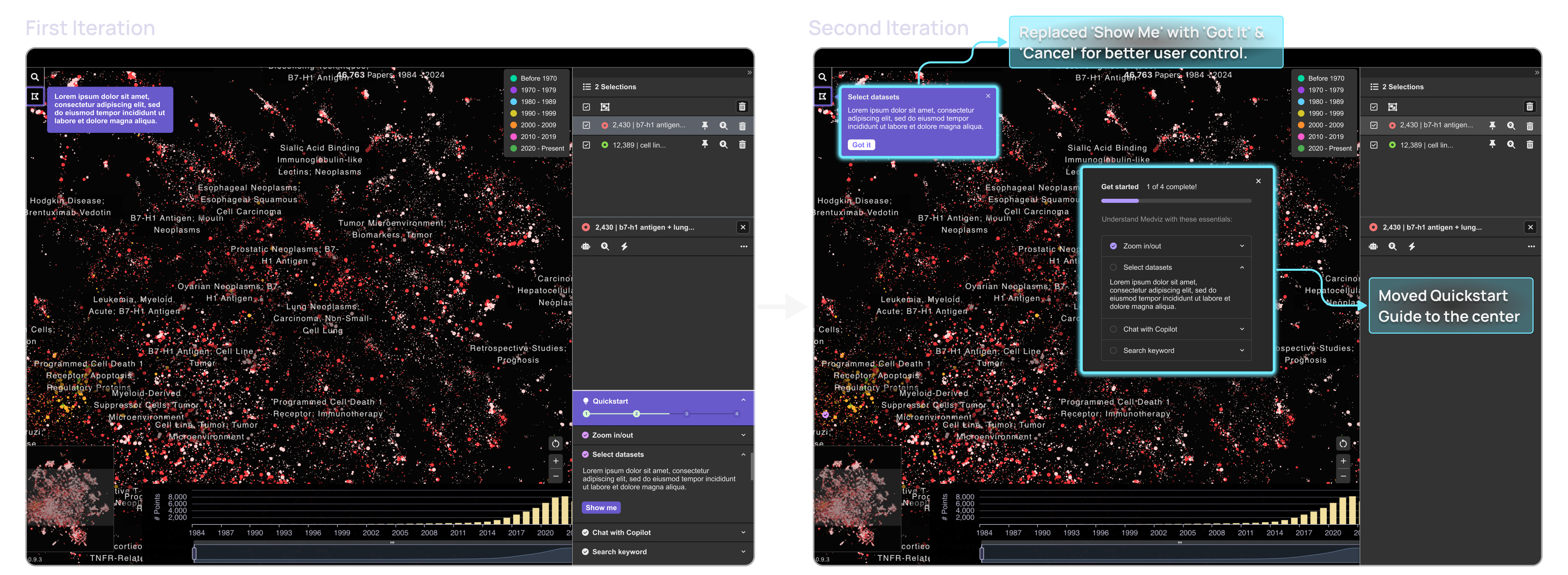
Even after improvements, testing revealed that users still struggled to locate features across the interface, leading to the repositioning of the Quickstart panel for better accessibility.
Second Iteration: Addressing Cognitive Load
Mockup 3: UI Optimizations for Better Navigation
Problems & Solutions
- Quickstart Panel Repositioned – Originally on the right, but users struggled since core features (e.g., Search & Selection) were on the left.
- Solution: Moved Quickstart Guide to the center for better accessibility.
- 🚫 "Show Me" Button Removed – Users found it redundant and inefficient.
- Completion Screen Added – A final step to reinforce user progress, adding a gamification element for motivation.

2.3Refining Quickstart: Improved Placement & Interaction Design

2.4Completion Screen: Reinforcing Progress & User Achievement
Testing confirmed that the new Quickstart panel placement felt more intuitive, and the 'Got It' & 'Cancel' buttons aligned with users' expectations from modern interactive tutorials.
key takeaways
I have gained invaluable insights and growth that have significantly impacted my career:
- Balancing Clarity and Functionality: Creating an effective onboarding experience required striking a balance between guidance and simplicity. Removing tutorial videos and refining the Quickstart panel ensured that core functionalities remained the focus without overwhelming users.
- The Impact of Iterative Design: User testing played a crucial role in refining the interface. Repositioning the Quickstart panel and replacing the ‘Show Me’ button with more intuitive exit controls directly addressed usability concerns, proving the importance of continuous iteration based on real user behavior.
- Designing for Familiarity Improves Adoption: Aligning with established UI patterns, such as ‘Got It’ & ‘Cancel’ buttons, helped create an intuitive experience by leveraging users' existing mental models, reducing onboarding friction.
- A Well-Designed Onboarding Experience Drives Engagement: By reducing cognitive load and making key actions immediately accessible, the refined Quickstart guide helped users get started faster and with more confidence.