highlights
MedViz Legend Color Redesign
Yale Medicine, Biomedical Informatics & Data Science — Dec 2024

My Role
Lead Designer — Color Research & Theory, UI & Data Viz Design, Iteration $ Feedback Process
Team
Huan He, Research Scientist
João Cardoso, Senior Software Engineer
João Cardoso, Senior Software Engineer
Timeline & Status
2 Months, launched
Overview
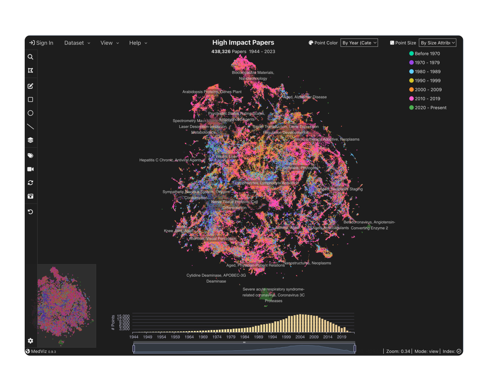
Redesigned the legend color system to improve contrast, readability, and modernity in MedViz visualizations. Applied updates to maintain consistency across data visualizations, including the yearly bar chart.

01.Medviz Overview with Updated Legend Colors.
context
Enhancing Data Clarity: A Modernized Color Legend for MedViz
To improve data clarity and visual accessibility, we modernized the MedViz color legend, enhancing contrast, readability, and consistency across visualizations.
- Problem Identification – The original colors had weak contrast, looked outdated, and didn’t effectively differentiate data categories.
- Color Research – Studied modern data visualization principles, referencing Nature Journal 150 for inspiration.
- Initial Design – Created a high-contrast, tech-forward color palette to enhance visibility and modern aesthetics.
- Iteration 1 – Adjusted colors to better balance data distribution (initial design had too much pink, making the visualization look off).
- Iteration 2 – Revised the color order based on internal feedback, aligning with rainbow color logic, which is commonly used for timeline data visualization.
- Final Implementation – Applied the new colors across MedViz visualizations, ensuring consistency in both legend and yearly bar chart.
- Launch & Review – Successfully deployed the new colors, enhancing contrast, readability, and data clarity.
Rethinking Visual Clarity: From Outdated to Intuitive
The original color contrast was weak, making it difficult for different categories to stand out, especially the purple shade.
The overall data visualization looked outdated.
Inspired by Nature Journal 150 for a modern and high-contrast color scheme.

1.0Original colors legend.
Design Process & Iterations
Beyond Aesthetics: Designing a More Intuitive and Data-Driven Color System
Building the New Color System: Contrast, Tech, and Readability
Create a tech-forward visual style.
Ensure each color contrasts well against the #000000 background.
Emphasize the increasing data density from 2000-present in the PD1 datasets.
2.0Initial color legend design.
Did not account for the data distribution, leading to an overly pink-dominant appearance.
First Iteration: Enhancing Contrast and Harmonizing Tones
design strategy
- Cool tones (green, blue, purple): Represent earlier data.
- Golden yellow (1990-1999): Marks a transition period.
- Warm tones (orange, pink): Used for recent data.
- Green and deep purple: Act as buffer colors to prevent warm colors from clustering too closely.
- The final pink shade was tweaked multiple times to balance a modern, vibrant, and high-contrast feel.

2.1Refining the 2020-Present Color: Tested multiple pink shades for better contrast, balance, and modernity.
Second Iteration: Aligning with Timeline Color Logic
After internal discussions, the team decided to rearrange the colors in a rainbow-like order, following a common timeline visualization logic where earlier years are represented by cooler tones (e.g., purple, blue) and recent years transition into warmer tones (e.g., red, orange).

2.3Second iteration: A high-tech color scheme for clearer year-specific data across formats.
Testing confirmed that the new color legend improved data readability, making year-specific patterns clearer across different visualizations.
key takeaways
I have gained invaluable insights and growth that have significantly impacted my career:
- Contrast & Readability Matter: Improving color contrast significantly enhanced data clarity, making patterns more distinguishable across datasets.
- Data Distribution Awareness: Initial designs overlooked how data volume varied by year, which affected visual balance (e.g., overly pink-dominant).
- Rainbow-Based Color Logic Works: Aligning the color order with timeline visualization conventions (cool to warm tones) improved intuitiveness and consistency.
- Versatility Across Visualizations: The refined color system adapted well to different dataset formats, ensuring clarity regardless of visualization type.By reducing cognitive load and making key actions immediately accessible, the refined Quickstart guide helped users get started faster and with more confidence.
- Iterative Testing is Key: User testing validated that the final color scheme improved readability without sacrificing the modern, high-tech aesthetic.