highlights
MedViz Temporal Distrubution
Yale Medicine, Biomedical Informatics & Data Science — Feb 2025
My Role
Lead Designer — Interaction & Usability Design, Data Visualization Refinement, Iteration $ Feedback Process
Team
Huan He, Research Scientist
Timeline & Status
1 Month, handed off for implementation
Overview
Redesigned the Temporal Distribution Bar to improve visual clarity, spatial efficiency, and usability. The new design ensures that users can analyze temporal trends more intuitively while integrating seamlessly into the MedViz ecosystem.
01.Medviz Temporal Distribution Bar Overview.
insights
- Problem Statement
- 1. The previous design was visually outdated and took up too much space.
- 2. While functional, it lacked modern usability enhancements.
- Research Questions
- 1. How can we create a visually more appealing bar chart?
- 2. How can we optimize space usage?
- 3. Are there any additional features that improve usability and user flow?
- References: Video editing dragging handles (commonly seen in media editing tools) inspired the time selection mechanism.

1.1Original temporal distribution bar.
Design Process & Iterations
Initial Design: Translating Insights into the First Concept
First Iteration: Improving Visibility & Selection Flow
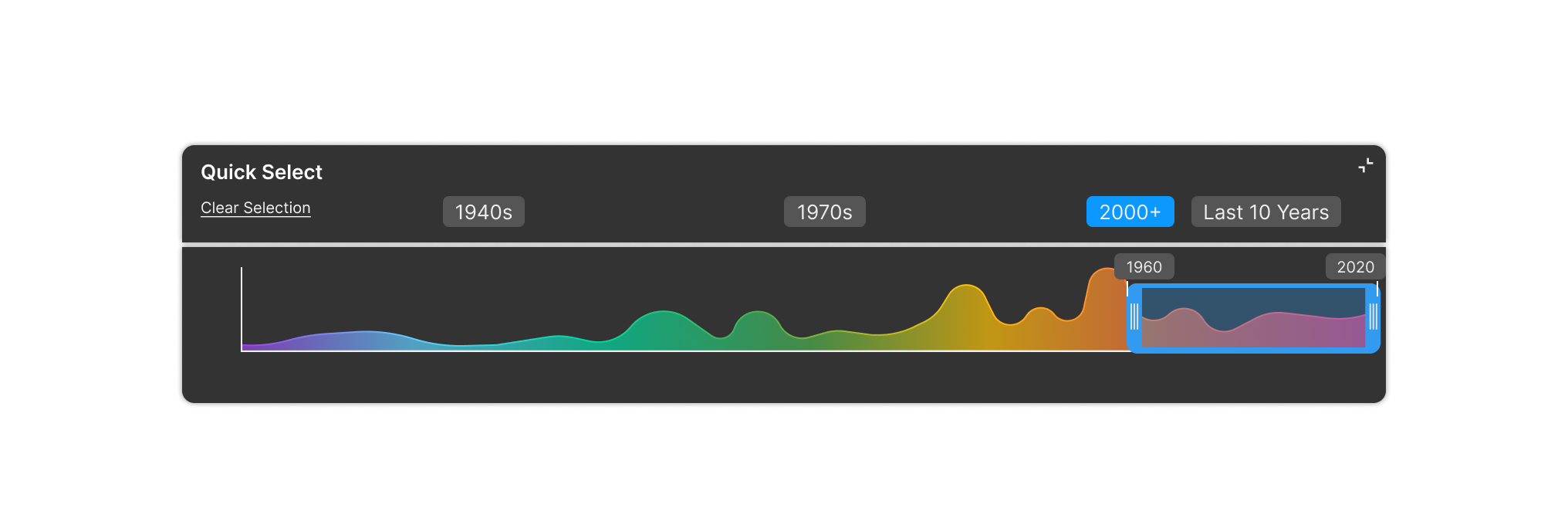
- Added collapse icon to minimize the bar if users need more space.
- Thickened the time range selector border for improved visibility.
- Added a Clear Selection button to make deselection easier (instead of requiring users to re-click their selected time range).

2.1First Iteration: Improving usability with a Clear Selection button, a collapsible bar, and enhanced time range visibility.
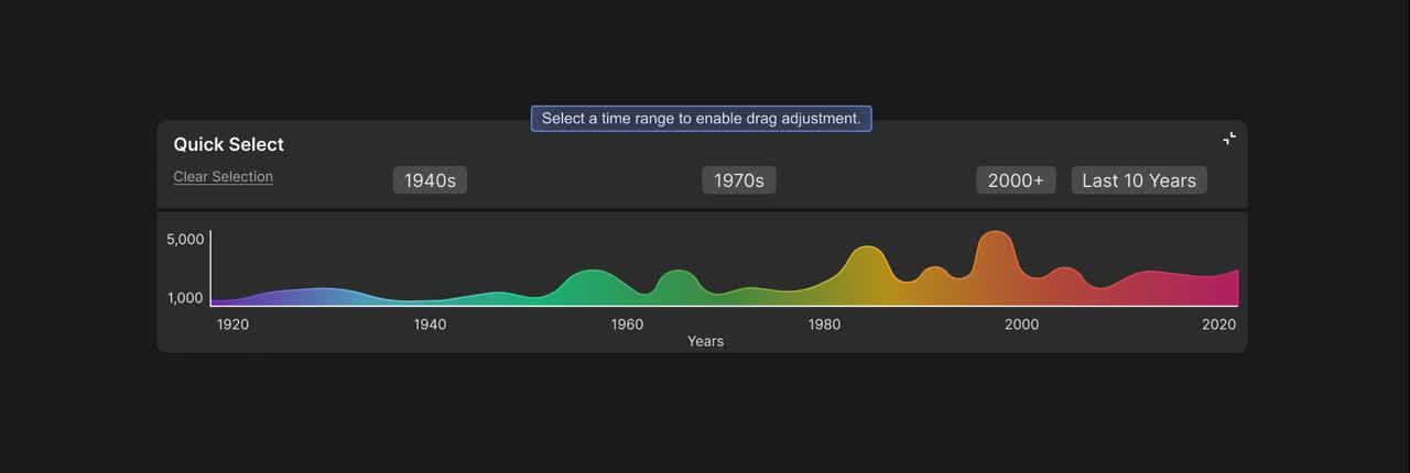
Second Iteration: Enhancing Visibility & Accessibility
- Refined user flow to keep the rainbow timeline visible.
- Color Contrast Accessibility Checking – Adjusted some colors to meet AAA contrast standards, ensuring better readability across all components.
2.2Second Iteration: Improved user flow ensures the rainbow timeline remains visible during interaction.
Testing confirmed that the refined user flow improved usability, ensuring the rainbow timeline remains visible and interactions feel more intuitive.
key takeaways
I have gained invaluable insights and growth that have significantly impacted my career:
- Preserving Data Context Enhances Usability: Keeping the rainbow timeline visible throughout interactions helps users better track temporal trends.
- Optimizing Space Without Compromising Clarity: The collapsible bar ensures flexibility, allowing users to focus on key insights while maintaining easy access to controls.
- Accessibility Matters: Adjusting color contrast for AAA compliance ensures better readability, making the visualization usable for a broader audience.
- Iterative Testing Drives Better Design: User feedback helped refine selection logic, leading to a more intuitive and efficient interaction flow.